
How to detect non-CVE vulnerabilities that standard scanners miss
If your application security program only tracks known Common Vulnerabilities and Exposures (CVEs), you’re probably missing a large share of your real risk. Across the …
TL;DR: Building for everyone, faster.
We’re moving from the why to the how. To scale accessibility without losing speed, we’ve overhauled our foundation:
In our previous post, we explored why accessibility is a non-negotiable for modern cybersecurity. But moving from philosophy to practice required a fundamental shift in our toolkit.
As Detectify scaled, we realized our original front-end architecture and design system (which had served us well in our early stages) was becoming increasingly complex to maintain. To continue shipping at the speed our users expect, we needed a foundation built for the future. We decided to transition to Tailwind CSS for its efficiency and clarity, pairing it with Shadcn/ui.
For the non-developers reading: Shadcn/ui isn’t just a library; it’s a collection of high-quality components powered by Radix UI. Radix provides the “primitives” – the invisible logic that ensures a component behaves correctly. This means that, by design, our new components come with a world-class accessibility foundation [1]:
By leveraging these industry-standard tools to handle the heavy lifting of accessibility, our engineers can spend less time debugging focus traps and more time doing what they do best: building world-class security features.
The result? We aren’t just building better; we’re building faster.
While code provides the structure, design provides the experience. We knew that solving for code-level accessibility was only half the journey; a component must be as intuitive as it is functional.
Our challenge was to evolve Shadcn components to feel uniquely “Detectify” while elevating their usability. This led us to a meticulous review of our brand palette. While our original colors were vibrant, we recognized an opportunity to enhance their performance on-screen. We have been refining our shades to ensure we meet (and often exceed) WCAG AA standards, ensuring every alert and vulnerability detail is legible in any environment.
Typography has also taken center stage. Security analysts spend hours staring at complex data; if a font is too small or spacing is too tight, it leads to fatigue. After looking into fluid typography and observing users, though, we realised that, although text still needs to be scalable and zoomable according to accessibility guidelines (WCAG 1.4.4), users appreciate being able to zoom out to see more of the data in the tool. We decided to pause fluid typography and focus on just optimising for our specific user case.
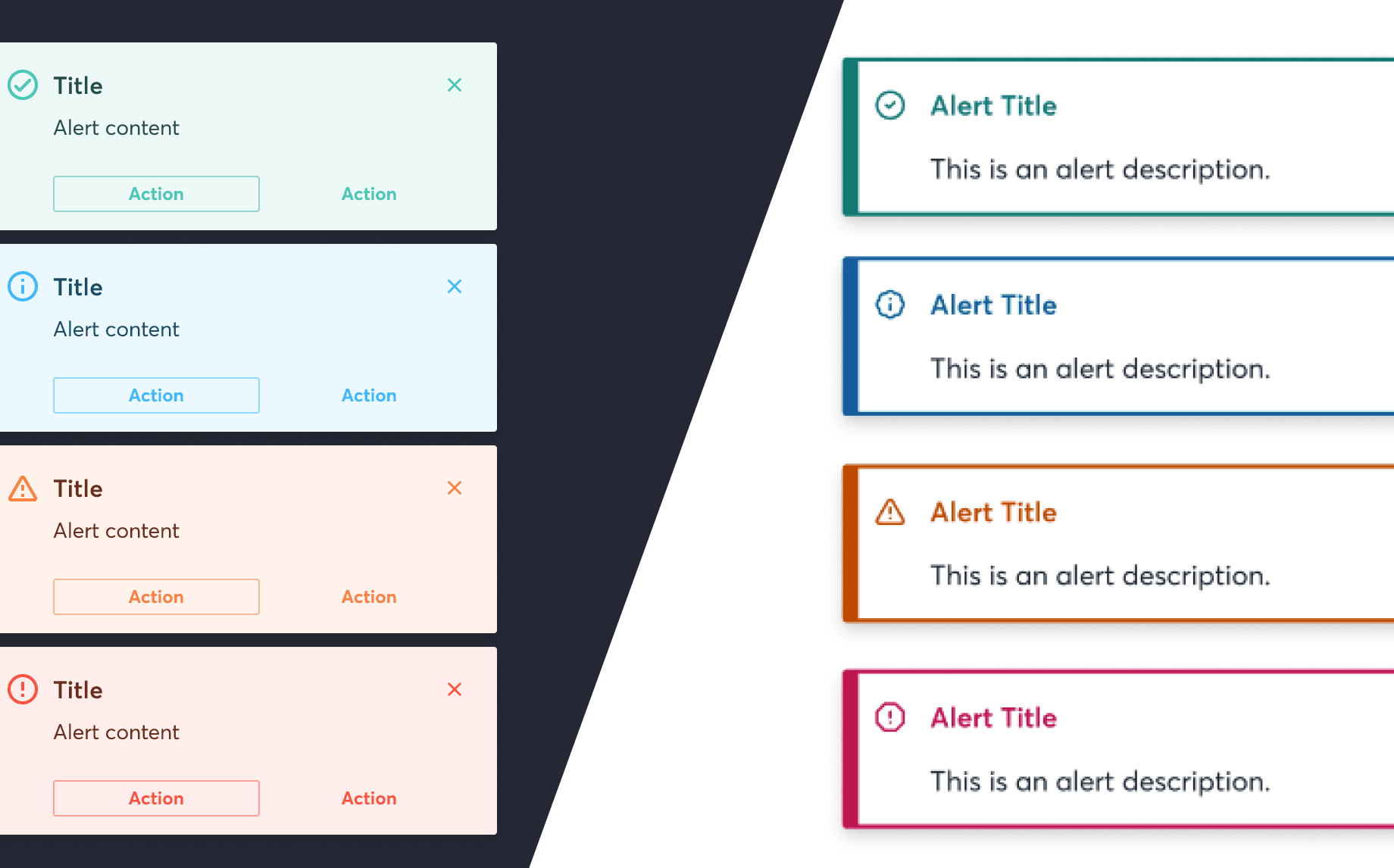
Our alert system provided a perfect opportunity for this new philosophy. Previously, we utilized a variety of alert styles, high-contrast, pale, and white-background versions. While flexible, this variety sometimes led to “decision paralysis” for both our users and our internal teams. Developers and designers would spend valuable time aligning on which specific variant to use for a given scenario.

When we redesigned this component, we set four clear goals:
To achieve this, we moved toward a clean, high-contrast approach. By utilizing a crisp white background and standardizing our high-contrast text, we more effectively leveraged WCAG 1.4.3 (Contrast Minimum). This allowed us to reuse standard components rather than creating dozens of special-case sub-variants.
We also focused on users with color vision deficiency (CVD). Using tools like Viz Palette [2], we refined our hues to maximize “visual distance” between states, for example, selecting a green with blue undertones and a more saturated orange to ensure they remain distinct from our error red.

Finally, we moved to multi-modal signaling, ensuring compliance with WCAG 1.4.1 (Use of Color). We no longer rely on color alone to convey urgency:

We are currently in the “thick of it” – restyling components, refining code, and ensuring our navigation logic is as intuitive for a keyboard user as it is for a power-user with a mouse.
But even when the last line of code is merged, our work won’t be “done.” Accessibility isn’t a one-time project; it is a culture. It is a continuous process of learning and teaching, ensuring that inclusive design is baked into every Figma file and every Pull Request from the very start.
At Detectify, we believe the internet belongs to everyone. Removing these barriers helps us ensure that the security professionals who keep the digital world safe have the best possible tools to do their jobs.
[1] https://ui.shadcn.com/docs
[2] https://projects.susielu.com/viz-palette
WCAG guidelines: https://www.w3.org/TR/WCAG21/
If your application security program only tracks known Common Vulnerabilities and Exposures (CVEs), you’re probably missing a large share of your real risk. Across the …
We’ve been listening to dozens of CISOs. In roundtables, peer forums, customer and prospect calls, on the record, off the record, at event floors and …